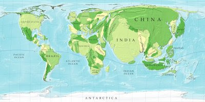
Some of you may have previously seen a map of the world with the south pole at the top, and can appreciate how a restructured map can contribute to a paradigm shift. This first map gives the size of the country based not on its square mileage, but rather its population. Note the size of Australia or Greenland, compared to Bangladesh. (click on either map to see enlarged image)
 This second map scales the size of the country to their share of the physicians of the world. This one kind of speaks for itself in the context of this blog.
 Worldmapper and Strange Maps are the origins of these images, for any cartography love among you.

1 comment:
Wow, where did all of Africa go?!?!?
Post a Comment